USB Flash Drive Art Examples Best Practices:
USB Flash Drive Logo Art:
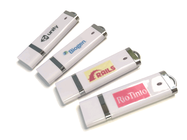
Correct:In these examples of good USB Flash drive logo images:
|
Incorrect:In these examples of a bad USB flash drive logo images:



Use the following image as your template. 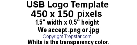
|
USB Jewel Case 2 Panel Folded Artwork Examples:
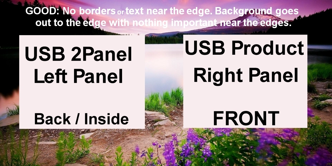
In this example of a good USB Jewel case 2 Panel folded artwork image, the background goes smoothly to all edges including
the center. There is nothing important near the edges (at least 1/4 inch). There are no bleed or crop marks.
|
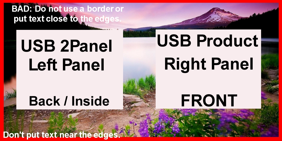
The image contains a border. Do NOT use borders, crop, or bleed marks.
It's a bad idea since we trim the packaging after we print. Trimming is never perfectly centered, so
a border near the edge makes it easy to see when trimming is off center.
|
USB Amaray Case Overwrap Artwork Examples:
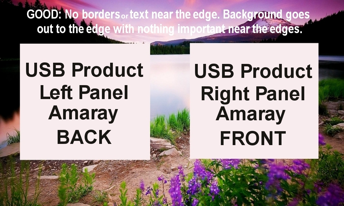
In this example of a good USB Amaray (DVD style) case overwrap artwork image, the background goes smoothly to all edges including
the center. There is nothing important near the edges (at least 1/4 inch). There are no bleed or crop marks.
|
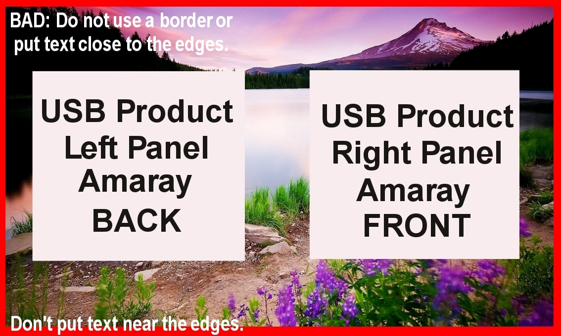
The image contains a border. Do NOT use borders, crop, or bleed marks.
It's a bad idea since we trim the packaging after we print. Trimming is never perfectly centered, so
a border near the edge makes it easy to see when trimming is off center.
|
Artwork Guidelines - It's best if your artwork:
- Is continuous from edge to edge.
- The image placed on the USB Flash drive is only 1.5 inch wide so use a small logo type image. Only a small amount of text will be readable so focus on a logo rather than a complex artwork.
- Nothing is too close to an edge or it may get cut off or not printed. We recommend you do not place text or anything important within 1/4 inch of any printed 2 panel artwork edge. This will ensure it will still look good after trimming.
- Do NOT put borders near the edges of the artwork in case printing or trimming is slightly off center.
These same "best practices" still apply for all types of artwork printing including CD/Jewel cases.
